When creating a brand, guides usually recommend that you first define yourself some key values and user segments you want to approach. However, I say you start with what comes easiest to you! In the case of our “Owl Basket” brand, that was a new logo!
So let’s check out how our logo was born. Starting with brand mark!
About this series
Having a brand is not just about getting yourself a logo. It’s about your image, the reputation that your audience forms of you. It’s what they think about you, not what you think about yourself.
However, you can affect what you want other people to think about you. You can choose the way you represent yourself. Through visual language, through your “voice”, through your interactions with people.
With branding, you can build yourself an image, or reputation that reflects your values and attracts your desired kind of company. And the fun thing is that anyone can do it!
This series is meant to be a simple, one-step-at-a-time approach to the many aspects of the branding process. I’m going to use our very own team brand, “Owl Basket” as an example in every step of the way.
Brand mark definition
I’m using the term “brand mark” to mean the “image” part of a logo. In the case of the Owl Basket logo, it’s the basket and the owls – including the one that has jumped out of the basket and is running on top of the word mark.
It all started with owls in a basket…
Owl Basket had an old brand mark that was quite literal in its visuals: owls are sitting in a basket.
Although adorable, the old brand mark had a couple of problems. It had a lot of thin illustration lines and small details that didn’t translate perfectly when I needed to scale the image to a tiny size. A proper brand mark should be simple enough that it’s discernible at any size!
One other problem was that the old brand mark didn’t communicate our brand well. Or at least the idea that we had in our mind about our brand!
So, although undeniably adorable, the old brand mark needed refinement. The owls and the basket would stay, but the look and message should change!

Basic shapes form the basic idea
Movement. Happy energy. Being different. These kinds of concepts floated around when we thought about the brand we wanted to be.
Then a visage formed in my mind’s eye: an owl jumping out from the basket!
So I drafted my idea in two basic shapes: a rounded rectangle and a circle. I cut out the top right section of the rectangle and fitted the circle in the empty space.
The idea worked. The circle looked like it was pulling out of the bigger rectangle. It was the owl, jumping out of the basket!
And just like that, the new brand mark had its basis!

Simple owls in a simple basket
Next, the basic shapes needed more shaping. The jumping circle needed to look like an owl. The cut rectangle needed to look like some owls sitting in a basket.
Rounded rectangles with varying sizes of rounded corners became everything I needed. The basket, three sitting owls, the jumping owl. Eyes, beaks, wings.
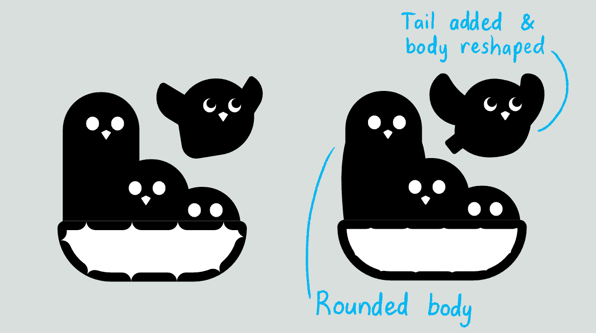
Simple rectangles formed a quick basis that was easy to build upon. I modified the jumping owl to have a more bird-like silhouette. The biggest “basket owl” got some body shape, too.
The owls needed to look like owls – and the basket needed to look like a basket
The owls I’d created thus far looked more like song birds than owls. So it was time to give them features that would make a person say, “That’s an owl!”
An owl’s most recognisable feature is its face. Big, round eyes embedded on a flat “mask”. Lo and behold, adding that face turned the generic birds into owls!
The basket needed the same kind of ”recognisability treatment”. And weaving pattern was the answer! I chose the plain pattern, or “checkers” pattern, because it’s simple, iconic and is certainly recognisable even in small size.

Refinements to make it look good as an illustration, but work well as an icon
The brand mark looked pretty nice already! Cute little owls and a basket, telling a story of a brand that is fun, adventurous and outgoing. The message was there.
Only thing left was to refine the mark.
First, I scaled down the mark to check that it was discernible even in small size. There had to be enough space between elements so that they didn’t blend together. The owls still needed to look like owls. And the tiny basket still needed to look like a basket.
Second, I modified the owls’ faces to be in a perspective. That way they became more friendly and substantial, as opposed to intimidating starers with flat faces. Each owl even got a little bit of personality as well!
Third, I added some plumage to the owls’ silhouettes. That one made a huge difference – the mark became interesting to look at and it worked well on its own.
The trick with the details is that they need to be prominent enough to be discernible, but subtle enough to not mess up the overall picture.
Here’s one more tip I’ve learned: make corners and pointy ends rounded. That way they render way better in a scaled down image. In the Owl Basket brand mark, I’ve rounded every point there is to ensure that everything shows well even in the tiniest of sizes.

The brand mark produced a tiny brand mark as well!
Once the brand mark was ready, I realised that we actually had two brand marks in our hands. The little jumping owl looks good on its own, so its perfect for very small spaces. And as a face of our Owl Basket creative team!