
If you’re familiar with our Realm of Owls webcomic stuff, you might be wondering why this blog doesn’t have that same “old yellow paper” aesthetic. Why the darks colors instead?
Well, the answer is that we wanted our blog to look different from the Realm of Owls brand. That is why I designed a brand new color palette for it, nicknamed “night sky and pink neon signs”.
These new colors didn’t come out of nowhere. There was a design process behind it. So in this post I will take you on a little tour to how a color palette is made, using our blog’s palette as an example.
What colors should I choose?
Start by finding inspiration
When deciding on a color palette, I’m always faced with endless possibilities. Not only there are millions of colors at my disposal, but also innumerable possible combinations of those colors. How can I even start making a choice?
The simplest sounding answer could be to just pick some favourite colors and start with that. It would have been fitting for our personal blog. So the color would have been something like orange, green, red or pink. But which one? And which hue of which one? And I do like blue in some occasions, too…
Favourite colors are not a simple starting point. To me, anyway. That’s why I prefer tools that graphic designers use. Such as:
- Taking a look at peers or competitors for inspiration.
- Coming up with an idea or a theme that drives choices.
- Brushing up on color theory.
In Owl Basket Blog’s case, we started out with the second point, an idea. Our blog was going to represent us as people, not as our goofy owl avatars that people are familiar with on the Realm of Owls website. Thus the blog was, and is, a kind of a behind the scenes place – the backstage to our comic’s realm.
That’s why it felt fitting to start thinking for an opposite to the “old paper” aesthetic. Trying out a complementary color to yellow or orange.
Experiment with online tools
There are many free online tools that help experimenting with color harmonies and finding interesting color combinations. Most of the ones I have used also have palette builders, so it is possible to make a whole ready-for-action palette on a single free platform.
I have personally used and can recommend the following three tools, listed from most complex to least complex:
- Paletton – A very versatile palette-making tool with good customisation options and useful preview features.
- Adobe Color – In addition to generating color harmonies, can extract themes (palettes) and gradients from photos. Has a giant Explore section of user-made themes. You can even save themes to your personal library if you have an Adobe account.
- SessionsCollege Color Calculator – A simple tool for when you just want to explore basic color harmonies and go build your palette elsewhere.
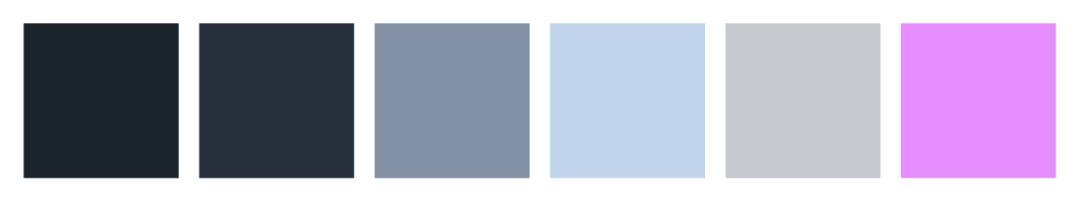
Owl Basket Blog’s color palette got its start in the SessionsCollege Color Calculator; I picked an old paper yellow from the Realm of Owls site and pasted the hex value into the calculator.
I ended up liking the split complementary color harmony the most, since it resulted in two interesting colors: warm blue and pink. Blue felt like the perfect primary color to contrast our comic’s yellow paper. Additionally, pink fit well as a link color, hinting just a bit at the red links on the Realm of Owls site.
Not to mention Gheralf loves pink. So we got some of our favourite colors in, even though I said it not being simple!

Adjust, experiment and never forget contrast
Fill the palette with close colors
Even though I said that online color tools can provide a ready-to-use palette, it’s rarely the case in my workflow. Those tools are a valuable stepping stone towards the right direction, but I usually take the next steps elsewhere.
Since Owl Basket Blog is powered by WordPress, I jumped right into the style customisation and started experimenting directly on the site. I played around with darker shades of blue, to contrast even further against the sunny Realm of Owls site.
Thus was born our blog’s primary color, an almost black “night blue”. I also added one darker blue to help subtly highlight blocks like text fields and footer.
Next, I made a couple of light and gray versions of the primary blue. As stylish as a black blog looks, it will feel stuffy and even daunting without some specks and blocks of lighter tones to freshen things up.
Lastly, and this is very important, I made sure the light gray used in text (and other important elements) had a high contrast against the background. Good contrast ensures good readability, so that the reader doesn’t have to strain their eyes trying to see the words.
Of course, an extremely high contrast is not always ideal, either. A pure white against our blog’s night blue background felt like burning our eyes, which isn’t nice when there’s walls of text to read.
Splash some color!
By adjusting the single primary color I ended up with a monochromatic palette. The different shades of blue made a combination that was easy on the eyes and kept the blog’s feel calm and stable.
However, calmness is dull and uninteresting. It was time to put some pink in! I gave the pink a bit more saturation to make it a perfect touch of energy to the blues. A neon light against the darkness of the night, if you will.
By popping out so well, the “neon pink” became our blog’s highlight color. It’s meant to draw a visitor’s attention to important things, mostly links. So whenever you see pink text (as is or while hovering a cursor over it), it’s a link. Always.
Category colors
Categories don’t usually have any defining colors in WordPress, but we were fortunate enough to find a theme that supported custom colors. As such, we are able to give each category an additional identity – and the colors also freshen up the blog’s look!
To help choose colors for the categories, I turned to color theory. It made it way easier to connect a suitable color to a topic; I just looked up color meanings and matched a meaning with a category.
Here are the categories (as of this writing) and my intended meanings for their respective colors:
- Art & design: orange = creativity
- Gaming: red = action
- Just a thought: blue = mind, thought

Cherry on top: background texture
Can you see that? There’s a very subtle grain texture in the background. In fact, it’s a paper texture! So there’s a bit of the Realm of Owls look left – it’s just covered in darkness.
The little texture is actually there to help with readability. A solid-colored text pops out a little bit better against an uneven background color, so the reading experience should be better than with a solid background.
With that final point out of the way, we have come to the end of this color palette thought process tour! What do you think of our blog’s colors? Did I nail the color choices or is there a problem somewhere? Tell us your thoughts!